Chrome Extension for Web Developers
Responsive Inspector
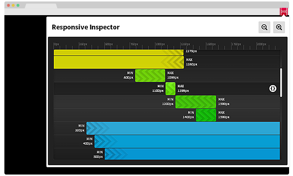
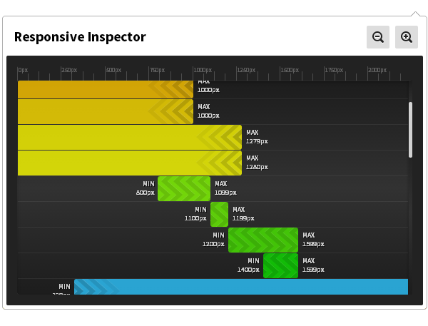
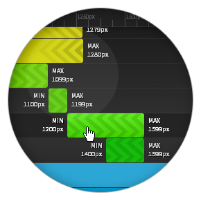
Responsive Inspector is a simple but powerful Google Chrome extension that allows viewing and inspecting media queries of visited websites. It is very useful when developing responsive web layouts as it can visually show what resolutions are defined in CSS stylesheets.
Done in collaboration with the awesome developer & evangelist Piotr Walczyszyn from Adobe.
CSS Media Queries direct code preview
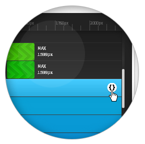
With just one click Responsive Inspector will take you to the exact point in the CSS in which the chosen Media Query is definied.
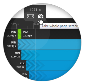
Full-height website screnshots
Taking a full-height website screenshots is just a click away with Responsive Inspector. Use it to show your work in a best possible way to your clients.
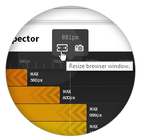
Pixel-perfect browser resizing
Scale the browser to match any of the media queries or choose any size you'd like to make sure your responsive website looks great in every scenario.

Integrated Share to Behance feature
With Responsive Inspector you can share your responsive webdesign easily with your Behance network as a WIP.
Sleek UI achieved with HTML/CSS
Easy to grasp user interface not only visually helps you understand media queries but also enables you to use the Responsive Inspector efficiently from the very start.